Apple’s Architectural Designs Improve Accessibility
For decades now, one of the defining characteristics of Apple has been the company’s unwavering and arguably unrivaled attention to detail. From small design flourishes in its software to forward-thinking details in the industrial design of its products, Apple’s obsession with even seemingly irrelevant details can be seen throughout the company’s product line. As a quick illustrative example, Steve Jobs once called up a Google executive on a Sunday morning because the yellow hue on the Google logo on the iPhone needed some immediate tweaking.
Though Jobs passed away a few years ago, an obsessive attention to detail has remained an integral part of the Apple’s DNA. Case in point: even the Apple Park Visitor’s Center at Apple’s new spaceship campus is replete with clever architectural design choices intent on improving the experience for individuals with special accessibility needs.
Highlighting some of the more interesting architectural aspects of the Apple Park Visitor’s Center, Twitter user xarph recently compiled a number of fascinating examples.
As often tends to be the case with innovative thinking, many of the designs showcased below seem obvious in hindsight.
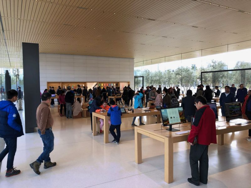
A few other examples include store merchandise that isn’t stored too high and conveniently wide aisles that can easily be accessed by individuals in wheelchairs.
One of the more interesting design features is that the parking lot itself rests at the same level of the visitor center, thus obviating the need for ramps. As xarph notes: “Instead of ramps, the entire structure is built on the exact level as the parking lot. Usually buildings are a curb-height higher since it’s cheaper to use an elevated concrete pad than get the earth at the site completely flat for the foundation. Money was no object here.”