The Hidden Cost of Touchscreens
In 2012 I tried out a brand new luxury vehicle at a automotive conference. It was a minimalist European model, and nothing seemed out of place — until I tried to use the in-car entertainment system. The whole thing was a monolithic rectangle of reflective, flat glass. The touchscreen software was bizarre and clunky. It took me five steps to pair my phone to the car, and I had to devote all my attention to the display just to figure it out. There were no physical buttons for the basics – like changing the volume or turning on the radio. I couldn’t imagine what it might be like to drive with it at night.
I expressed my frustration to the man sitting next to me. “I can’t believe the company let this thing on the road with this horrible display! It’s as if this entire system was tested in a lab under ideal conditions, but never once on the road with a single confused driver!”
The man started laughing at my outburst. Then he apologized and gave me his card. As it turned out, he was the head of company.
“The quality of the touchscreen is my fault”, he admitted, “we never tested it on the road”. Apparently the management was so convinced that the entertainment system’s blue-tinted, rectangular touchscreen interface was “the future” that the company didn’t even bother using it on the road before releasing it. After all, Tesla had recently debuted (to much acclaim), its first model which boasted a similar touchscreen system. Now that this new company’s own car was in mass production, it would take many years to undo the damage.
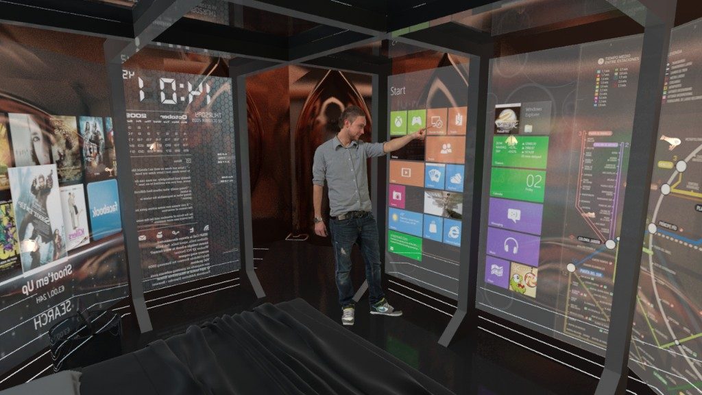
Physical interfaces are crucial for automotive usability. Operations rely on a simple glance or muscle memory. Touchscreens, by contrast, force drivers to look. Because buttons are not fixed to specific locations, screens inhibit muscle memory and findability. Touchscreens compete for attention with the driving process, adding to the dangers of distracted driving.
Serious interfaces — those that are repeatedly used by a knowledgeable professional and/or in potentially hazardous situations, should not be touchscreen based. If a touchscreen must be used, it should be embedded alongside a set of fixed, physical buttons that support muscle memory and single actions.
What’s happening to in-car interfaces now? Five years later, we’re seeing some car models stick to physical buttons and dials, and that’s a great relief.
Beyond safety considerations, there are productivity gains inherent in physical controls. When I worked in a mailroom during college, I processed packages with a very ugly keyboard-based system. I learned the machine in a single day and it quickly became part of me; the data density it could rapidly handle was enormous. In the same way that high school students bond with graphing calculators in Calculus class, we can become intertwined with these physical interfaces in a way that doesn’t force us to think when we use them. We work with them and they work with us. They could be considered one of Donna Haraway’s “companion species”.
Touchscreens are not completely terrible. In the right cases, they’re incredibly useful. They’re already pervasive in service-related industries, but these screens usually have software that is glanceable, color-coded and professional. And they’re not meant to be used in moving vehicles!
Touchscreen design could benefit from some basic design principles. Color-based interfaces take less time to parse when they are glanced at. Image-based interfaces take longer for the brain to process, and the lack of contrast can be confusing, because each item must be distinguished from adjacent items. When so many images look alike, service workers must rely on position and muscle memory for speedy use.
When I worked in food service and in the mailroom, the uglier touchscreens were always easier to work with. They were color coded with bright, contrasting colors, making the boundaries between numbers or items very obvious. I found that the colors reduced mistakes. I’d usually tap the right items after barely even glancing at the interface. After a while, I’d only check the screen for mistakes at the end of the process, before submitting an order or printing a receipt.
Most touchscreen interfaces don’t use high contrast colors or locked, static buttons for basic functions. They bury actions under multiple buttons, and this leaves us dangerously hunting for the right button while trying to drive, or our frustrated passengers trying to help us get our phone connected via Bluetooth.
Square’s point of sale system is used by both customers and employees, and it’s important that the systems look good — but processing orders and mistakes can still be made if the images look too similar to one another. I know of some coffee shops that have replaced their product images with memes or high contrast cartoon characters. It’s a cute tactic that works for both employees and customers.
Will we see a return to analog interfaces? I certainty hope so. While analog interfaces aren’t applicable to every situation, they do force designers to make permanent decisions. And because specific choices must be made for physical button placement, it’s harder to design an unusable analog interface. And design decisions must be final. Software interfaces can be quickly changed and deployed without the same process — and the world is filling up with nested, mystery-meat menus and confusing user flows.
Last week, my neighborhood grocery store replaced all of its keypad-based machines with touchscreens. Now the grocers must take additional time to look up at the screen and tap through a few different pictures to select the correct items. In addition to the loss of productivity, the poorly-designed systems leave employees unhappy. I used to watch veteran supermarket workers deftly tap PLU codes for produce into a keypad. They bagged fruit with one hand while typing codes with the other. Their precision and memory was often a point of pride and mild honor. Now, there’s nothing left of that tiny speck of mastery. Worse, the new screens require different levels of focus, making it difficult for some workers to read the text. I’ve watched workers remove their glasses to peer at the display before tapping the right product image. I even found them apologizing — on behalf of the machine.
I asked a cashier if he thought he could find the same comfort with the touchscreen like he did with the physical machine.
“Absolutely not,” he grumbled, “and when this one becomes tolerable, they’ll change the software on me.”
These issues only hint at the troubles intrinsic in touchscreens. In a follow-up post, we’ll look at how they further enhance the social frictions we’re already seeing in the rise of automation.