7 Basic Design Principles We Forget About
Some of them will always apply!
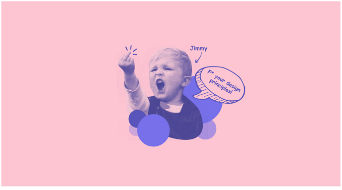
Once upon a time, in 2018, there was a guy called Jimmy. He was a designer at a company called Shmuckle. All he dreamt, night and day was to become one day a famous designer. His muse and inspiration was Steve Jobs. Being obsessed with him, he was always preaching good design in his company. Jimmy was all about delights, intuitive design and innovation. Until one day he hit a creative block.
Jimmy was working on an important project for his company that would help him promote his career. He was tasked to redesign the main dashboard of their product. But he could not achieve the appropriate result for the interface. As a backup plan, he started rewatching all his favourite design videos, reading articles and listening to podcasts. But no result. He still did not know how to proceed.
Luckily, the company’s senior designer, Sarah, was passing by. She saw the poor guy struggling. A smile sneaked on her face, remembering her early days, how she was struggling too, to create a great product. But now she is more experienced and knows all the tricks and tips that can help her to get through any creative block.
“Hey Jimmy, I saw you did not update the new design you were working on. What’s the problem?”
“I am trying to design this improved interface for our customers. It should be easier to use, show better and improved stats, and solve a couple of other accessibility issues, but I don’t know… It does not feel right. I tested it with customers and some say it works great, some hate it, some say we need to change it. I don’t know what to do.”
“It’s okay, it happens when you don’t have a proper foundation. Look, there are a couple of principles that will help you design great products. Luckily, you don’t need any voodoo magic. Apply them when you feel stuck.”
Jimmy quickly got his notepad and pencil out, and with the excitement of a kid before Christmas, he was ready to take notes “What are they?”
“Let’s go for a walk because you stay too much behind your desk. You gotta refresh your mind a bit” Sarah grabbed a cup of coffee from her desk an continued “Okay, listen. There are a couple of core principles that you should go through once your product is finished. An answer to all of the will allow you to see things clearly. Your design should always have:”
Clarity
“Jimmy, if you leave only with one thing, then remember this — a messy mind will result in a messy product. So always try to remove the clutter from your thinking because it will impact the end result. Throughout the design decisions you make, there are a couple of things to always keep an eye on:
- Business goals, customer’s problems and functionality motivate the design. In that order;
- Never sacrifice functionality over beauty;
- It should always be self-explanatory on what to do next;
- Highlight important content through negative space, colours, fonts, and graphics, and other UI elements;
- Text is legible at every size;
- Icons are precise and sharp;
- Extras are subtle and appropriate;
- Your users should instinctively know what to do and where they are at all times;
The final look of anything is the by-product of the clarity (or lack of it) during its design phase. Clarity of intent will translate into clarity of result — Massimo Vignelli
“I remember that Massimo Vignelli wrote in his The Vignelli Canon that a confused and complicated design always says something about the person who made it. It says that the person had a complicated and confused mind” said Sarah. Jimmy noted that quote down to use it later for inspiration.
Actionable Interface
“Now, remember this. We must always strive to design digital products that keep the current task clear and in focus. An actionable app anticipates the user’s needs by ensuring that what’s onscreen is always current and relevant. And the app becomes an extension what a user intends to do. So for example if a user opens your app to solve a task/need and you don’t give him the solution, you made poor choices” said Sarah.
She stoped for a moment and took a couple of seconds to form her thoughts and continued “You see, the whole point of what we do is to make sure that our solutions come to the right user, at the right moment, in the right context. Of course, it is a long run until we can get there through multiple iterations.”
It is opinionated
“Some designers and developers argue that software should be flexible and able to satisfy the needs of all customers. Well, Jimmy, that’s bullshit. There is a saying that even applies to this:
Trying to please everyone is a recipe for stress, misery, lost resources and frustration. So don’t be afraid to lose people, be afraid to lose your vision — Unknown
A great and useful digital product must always have a clear picture of whom it serves. Who is the real customer? You should keep that in mind and develop solutions around their needs. The best digital products have a vision.” said Sarah stopping near the window and leaning to watch people walking by. “And what about the rest of the customers?” asked Jimmy. “The rest will wait in line. And we will get back to them once our main customers are satisfied. By main, I mean our core people we make the product for. And remember, if they don’t like your vision, don’t worry. There are plenty of other visions on the market that will make them happy. Our job is to find our own tribe” said Sarah with a warm smile.
When someone uses software, they’re not just looking for features. They are looking for an approach. They are looking for a vision — Getting Real by 37Signals
Feedback System
“Next important principle is Feedback. It acknowledges actions and shows results to keep people informed.
- Interactive elements should be highlighted briefly when tapped;
- Progress indicators communicate the status of long-running operations;
- Animation and sound help clarify the results of actions;
You see, Jimmy, with all the digital world being so advanced we still feel the need of human interactions in it. Our body (eyes or tactile sensors) needs to feel feedback to send signals to our brain that things work. This means that our designs, as in the first point I mentioned, should give clear feedback on what is happening on the screen. And a user should not make an effort to understand that. So whenever you have time, make sure to pick up a book on how the human mind works. It will only advance your skills.” said Sarah and sipped from her coffee continuing her walk through the office.
Metaphors
“Metaphors — here I don’t mean literary metaphors, but something similar” said Sarah. “Like a Digital Shakespear?” laughed Jimmy. “Sort of. You see, people learn faster when an app’s interface and actions are metaphors for familiar experiences. The experiences may come from digital or real world.
Metaphors work well in because people interact with the screen. They move views out of the way to expose content beneath. They drag and swipe content. People toggle switches, move sliders, and scroll through picker values. So always try to learn what other apps are your core customers using on a daily basis. This will allow to design similar experiences and remove any friction or create uncomfortable learning situations” said Sarah.
Context Over Consistency
“Let me give you an exercise here. For example, we have a calendar on the main screen. Do you think it should be a grid or list?” asked Sarah. “Hmm… We should stick to the grid. It is more compact and structured. Am I right?” said Jimmy.
“It depends on what a user’s main goal is. The same question for the reporting page. Should we have a grid or list calendar? And again, it depends. Do we need global navigation on all pages? Again, it depends on the context. That’s why context is much more important than consistency. It is ok to be inconsistent if it makes sense to have a different form or style if it brings more value to the context. It’s better to be right than consistent” said Sarah.
Good design is the by-product of a proper contextual evaluation, not a whimsical creation out of context, no matter how brilliant its visual aspect may be. Brilliant design solutions have always taken into consideration the contextual consideration — Massimo Vignelli
Defensive Design
“What do you mean by defensive?” asked Jimmy. “It is something that others know as intuitive design” said Sarah. “Oh, I know that! It is something that Steve Jobs talked a lot about!” exclaimed excited Jimmy. “Yeah… but do you know what intuitive is?” asked Sarah. “Something that predicts a user’s actions? So it solves a need before it arises?” curiously asked Jimmy.
“Yes and no. It is not something that predicts your actions, but the defensive design is for when things go wrong. And things go wrong all the time. No matter how careful you design it, how much research you have invested in, your product should always have a backup plan. Defensive design is always on the lookout for what problems may arise” said Sarah.
Trust me, if the experience is negative for your users, they are unlikely to forget it.
“I don’t quite get it…” doubted Jimmy. “Take as an example safe driving. When you drive a car, you are always on the lookout for any type of danger: reckless drivers, kids crossing the street, and other dangerous scenarios. So we as designers, must always keep an eye on what can be fixed so we don’t break the UX. Because a good defensive design can break or improve a customers experience” said Sarah.
Slowly getting back to Jimmy’s desk, Sarah said “And that’s it. Did you take any notes?” Jimmy surprised “What do you mean that’s it? Shouldn’t there be more of them?”, Sarah with a warm smile said “There are a lot of them. And every person or company has his own design principles. But you don’t need to know all of them to design something great. A handful of them to give you a great start. If you use these, you are already better than the rest. And other design principles will come with time and patience. Now back to work.”
Afterword
There are of course a lot more principles that we should use, but the problem is that a lot of us still don’t use these. And it mainly happens because we prioritise tasks and goals that are not important to our customers. We should always strive to find the right balance that works for our product and users.