It’s as easy as thumb, two, three.
In most apps, it’s common to see a search bar up at the top of the screen. On social media platforms, such as Facebook, Instagram, LinkedIn, and even Snapchat, the search bar is at the top of almost every main screen. In transportation apps, that style is almost ubiquitous.
Why is this? Apple doesn’t suggest that a search bar sit towards the top of an app’s UI, nor does the HIG suggest that it should be persistent.
If you Google why search bars are at the top, a Quora post with this exact question pops up. “Users have been trained to expect a search (if there is one) at the top. It’s a convention that a designer breaks at their own risk,” says the top answer.
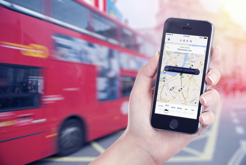
A product designer at Lyft did exactly this, and in a magnificent way.
yft took a different approach with their search bar. Instead of a floating field up top, they added it to an overlay towards the bottom-mid section of the screen. This simple change made it more accessible for almost 100% of users.
Although we don’t think about it too often, a search bar all the way at the top of the screen is hard to reach. Especially for users who have smaller hands or users who have less flexible hands, reaching up is annoying, mostly because the top of the screen is far away from where their fingers sit.
If you visualize most apps, the main content is in the middle or lower-mid area. Tab bars for navigation, posts on social media, and keyboards on messaging platforms are all examples of important pieces of experiences sitting in a more reachable position.
Lyft’s search bar isn’t at the tippy-top, but it’s not at the way-bottom, it’s in a sweet spot for thumbs.
As you can see in this graph from 2015, around half of phone users interact one-handed. And, as you can see from this amazing meme that resurfaces once a year, that’s how people do it. Lyft doesn’t make you stretch your thumb one bit; the search bar is in the sweet spot.
Just look at this graph from the same study, half of all search bars are in the “Out of Reach” area. Lyft’s is right beneath the thumb in that diagram in the green (good) area.
How can designers learn from this
Look at your UI analytics, run user-interviews, look at what elements of the interface users interact most frequently. In transportation apps, that usually is the search bar. In social media, it might be photos or like-buttons. In shopping apps, it’s probably products.
Make sure your most frequently interacted with elements are the most reachable elements of your interface.
Don’t be afraid to break the mold, someone has to do it first. Although you want to make your UI familiar to your user, keep in mind how comfortable it is as well.
Think about the different sizes and ages of hands experiencing your interface and the demographics your catering to. Ask yourself, “Is my experience adaptable for and aware of the different abilities of my users?”
And finally, don’t become too attached. Styles change, new designers might join your company. Remember 3D-ish elements in iOS 6? Welcome change, don’t push it away.