Before you can master design, you must first master the fundamentals
By Jonathan Z.
Last week, one of my readers sent in a question: How do I become a better visual designer?
As I was thinking about how to answer this question, my mind wandered to my experience with learning Mandarin Chinese. Recently, I decided to teach myself Mandarin. When it comes to learning a new language, you first have to start with the fundamentals. Nouns, pronouns, and verbs form the basis for conveying more complex ideas.
Language is a way that people communicate concepts to one another. Visual design is a visual language. And learning visual design is no different from learning a new language.
Good visual designs aren’t born. They are made.The key to becoming a better visual designer is rigor. You will only improve as a visual designer if you make a conscious effort.
Here are some fundamentals you should master so you can take your visual design to the next level.
Fundamental #1: Go back to the basics with type
You can tell a lot about a designer by looking at their typography. This is because type is a fundamental basis for design.
You can create entire designs with just type. You can also base designs on type, taking subtle queues from the fonts that you choose. In order to improve the typography in your designs, first start by learning the basics.
Develop a vocabulary for describing type. Learn about what terms like tracking, kerning, and leading mean. The article A Beautifully Illustrated Glossary Of Typographic Terms You Should Know is a great visual resource for learning those terms.
Then, if you want a comprehensive understanding of how to apply typography to the web, read Web Typography: The Elements of Typographic Style Applied to the Web.
Finally, learn how to pair fonts together. A great resource for this is FontWolfand FontPair. Being able to pair fonts together will dramatically change the dynamics of your design.
For a more in depth exploration of typography, you can read my article: Typography can make your design… Or break it.
Fundamental #2: Use space to create balance
Spacing helps establish vertical and horizontal motion in your designs. It’s pivotal for creating visual hierarchy and forming association between elements.
You can always look at sites like Behance and Dribbble for inspiration on how to space elements. But it’s important to develop your own intuition for using space to create balance and visual harmony.
When studying typography, you may have noticed the importance of spacing in type. Adjusting the kerning and leading for fonts is a great exercise for developing your eye for spacing. For this reason, I recommend you try KernType, a game where you compare your kerning solution to a typographer’s solution.
Another exercise that will help develop your eye is the following: Take an existing design, draw an x and y axis, simplify the design into basic shapes, analyze how the design is balanced, and then rearrange the elements. Pay close attention to how negative space affects the balance of the elements.
Fundamental #3: Use size to establish visual hierarchy
When it comes to creating visual hierarchy, sizing is second to none. By using size to convey visual relationships between elements, you can establish flow.
Sizing is one of the reasons why grids are useful. You can use grids to help you size elements using ratios to convey importance.
Once you have determined a size for an element, keep it the same across all instances of it. In design, consistency is king.
Here’s an exercise that will help develop your eye for sizing.
The key is asking for feedback.
Sketch or wireframe a landing page. Then ask a friend to look at your design. Get them to circle the elements that stand out the most. Afterwards, have them number the circled elements based on visual weight. Are the results what you expected?
When doing this exercise, keep the following questions in mind:
What is the conversion goal of the landing page? How can you optimize to meet your goal?
What is the relationship between different elements? What elements do you want to emphasize?
Does your layout successfully guide a user’s eye through the page?
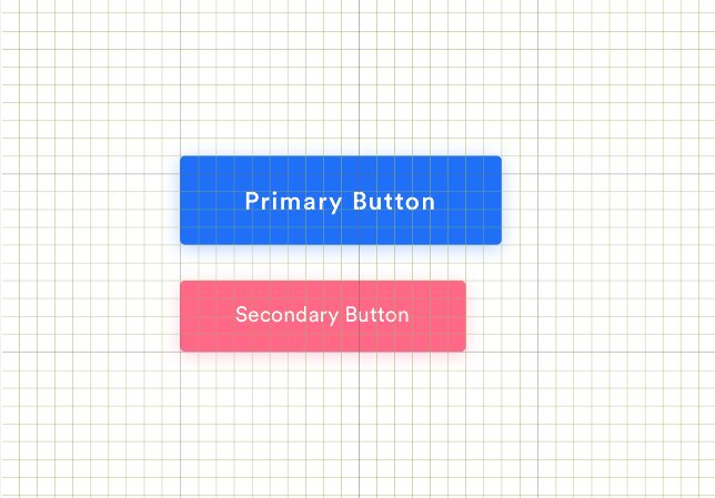
Fundamental #4: Use color to convey meaning
Color plays many roles. It conveys meaning, creates emotional resonance, and brings unity to designs.
For a deep dive into color, you can read my article Designing in Color. Here are a few key points from the article.
Identify the purpose of your design before choosing a color palette. Good design align its color palette with its purpose.
Identify your audience. People perceive colors differently. Colors have different effects on people based on their personal preference, cultural upbringing, and experiences.
When choosing a color palette, simplicity is key. Choose a neutral background color. Then choose a primary and secondary accent color. Finally based on your other colors, choose an error and success color for your different UI states.
Once you have a good grasp on the basics of color theory, color comes down to experimentation and iteration. Actively try break out of your comfort zone and try new color palettes.
Here’s an exercise that will help develop your eye for color.
Spend time compiling color palettes for things around you like photographs, magazines, and your favorite shows. Then take an existing design and apply new color palettes to it.
Take note of how it changes the mood and tone of the design. Does it change the meaning as well?
Treat your work as a craft, in that there is always something that you can improve. Rely on yourself to be the motivation to become a better designer.