Designing for Luxury
By Alexa L
For me, the definition of a luxury is that rather than being a necessity, it is an indulgence, it has to be expensive, resplendent or extravagant and elegant. Luxury fashion therefore could be any item of clothing or accessory that matches these features.
Brands such as Gucci, Louis Vuitton, Prada etc. are all examples of the most successful luxury brand by net sale. These are all examples of the most successful luxury clothing and accessory brands, drawing in large numbers of customers and sales. The most successful luxury brand by the 2017 annual turnover, Louis Vuitton has managed to accumulate a brand value of €42.6 billion. Following closely behind are Hermes, Gucci and Prada, who follow along similar production lines as Louis Vuitton and who are principally known for producing luxury fashion goods.
How do typography and colour impact the success of a luxury brand?
Luxury brands create a sense of exclusivity to stand out, by producing things that some people can’t have but other people can makes you desire it more. Brands who stand out as exclusive and distinct invest a good amount of their marketing budget with a good design agency, because they recognise the power that strong branding has–a sense of rarity and power is presented through a visual identity and is then translated to those who own it.
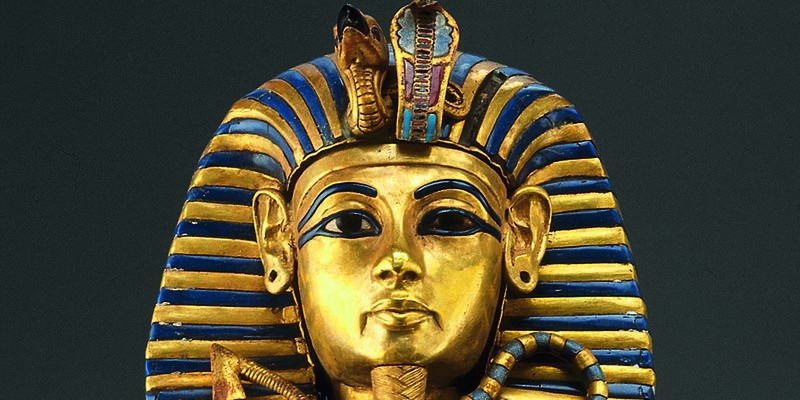
One way these companies place themselves as luxury brands (apart from having good products), is through the intelligent use of colour, materials and typography that are associated with luxury and affluence. For example, the colour gold is the colour of success, achievement and triumph. It’s associated with abundance and prosperity, luxury and quality, prestige and sophistication, value and elegance. The psychology of gold implies affluence, material wealth and extravagance.
Be it in printed material or a hint of it on digital media, gold can associate your brand with these feelings. Equally as important, typography can convey a certain mood or feeling.
Typography
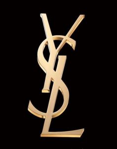
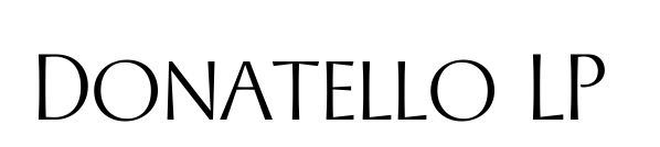
Donatello is a classically proportioned font with subtly tapered strokes, inspired by the lettering on the fifteenth-century cantoria by Luca Della Robbia in the Museum of the Duomo, in Florence. It was influenced by the Renaissance period–a great era of transition from the dark ages to affluence in Europe, which was also seen in the clothing worn by Europeans. The font Donatello was designed by Paul Shaw and Garrett Boge in 1997 and it is now used for Yves Saint Laurent:
Well considered design choices subconsciously influence us to mark a brand as premium, below average or whatever else we let our minds make up about a thing. As a result of colour (and typography), the brand’s high social standing can make consumers “lower their defences” and pay extreme prices. Shama Hyder, the CEO of Zen Media, said: “A luxury brand offers him or her an opportunity to showcase a lifestyle and a value system.” The exclusivity that a brand has brought to its customer can act as branding and advertising itself. In this way, good graphic design for the brand creates a circular feedback loop type thing.
I am not saying that every luxury brand needs to use a classically inspired serif font or print with gold; you can communicate luxury through minimalistic typography and colour too. The important thing, however, is to work with a good designer who will look at your target audience to understand exactly what communicates best to them, so they will want to buy from you.
Storytelling a Campaign
An effective marketing technique used by luxury brands to stand out is through storytelling. A story is developed through a creative team, usually comprising copywriters, brand strategists, artistic directors as well as designers and technicians who all get together to look at a clothing line or range and look at different ways to tell the story of the specific product range.
It can be done through photography, content videos and also in fun and quirky ways, for example through illustration.
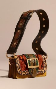
In January and February 2016, the Burberry collections campaign was the first to feature the brand’s new single “Burberry” label, which replaces “Brit”, “London” and “Porosum”. The print and outdoor campaign was uniquely brought to life by combining vernacular, hand-drawn illustrations by British artist Luke Edward Hall with impactful and bold photography by Mario Testino.
Hall produced a series of original portraits and still life illustrations for Burberry, which features its Patchwork Bag. No two styles of the bag are the same and each one is individually named after a British town or street. With no brush stroke being the same, illustration is the perfect media to communicate this exclusivity and a bit of British eccentricity.
“I love the human element of the drawings onto the photographs. In this digital world, we are living, the softness and handmade feeling adds something intimate,”
– Mario Testino.
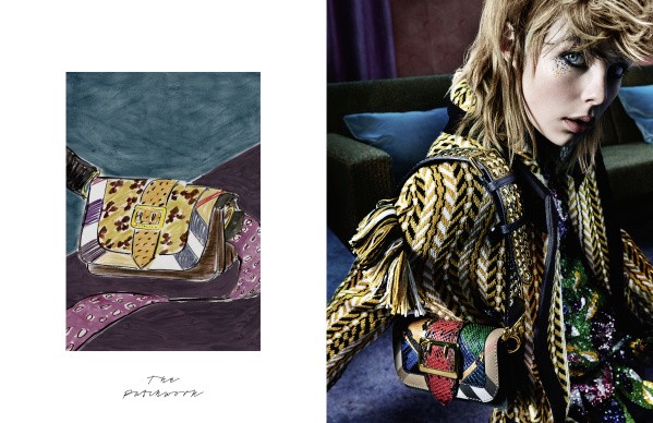
The artist’s work was displayed at Burberry’s flagship store in London’s Regent Street from 11 June–30th June, bringing an immersive, interactive experience to the brand. The fact that Hall’s illustrations also fit within the category of fine art brings with it an added quality to the Burberry campaign; had they chosen another amateur artist, the messaging of the campaign would’ve had a completely different tone and impact.
“His beautiful illustrations next to Mario’s powerful photographs capture the artisanal spirit of the collection.”
–Christopher Bailey, chief executive and chief creative at Burberry.
By firstly researching what the story behind the range was, and then looking at how best to communicate it, Burberry then collaborated with the right illustrator and photographer duo to visually communicate their message to tell the story of their Autumn/Winter 2016 collection.
Instagramming for Luxury
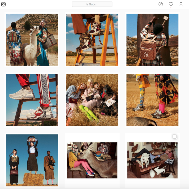
A good example of how luxury brands present themselves online is Gucci, compared with the high street brand Primark.
Gucci (left) have invested in a creative team who have carried out an art directed campaign which changes for each clothing range. Viewers who follow the brand notice a new story is being told every few weeks, or along with each new product launch/clothing range. This is done in weird and wonderful ways. The attention into the actual item of clothing or accessory is placed in well considered settings according to the campaign. This is a key strategy as it puts more focus into the exclusivity and quality of the item, no matter in what situation.
Whereas Primark’s scatter gun approach to their Instagram feed is fitting with the wider audience who have different needs and generally, value quantity and cheap price over quality.

I admire Gucci’s shifting visual themes per range as it helps us understand a brand new range has been launched in an interesting way. However, Primark’s social media / campaign approach is equally appropriate.
There is no right or wrong; it just depends on which audience you wish to communicate to. Crucial, however, is to work with a good creative team who will create a strategy for you to follow so that you can communicate to and with your audience.